Productivity
Line Graph Guide: How to Create and Read Charts That Reveal Trends (March 2026)
Learn to create and read line graphs with our complete guide. Covers chart components, types, best practices, and AI tools. Updated March 2026.

You need a quick visual of monthly signups, so you plot the points and connect the lines. Then your manager asks why the trend looks so volatile, and you realize the x-axis skipped weekends. Line graphs reveal patterns only when the intervals, scale, and structure match your data. This guide covers the core components, the types that work for different comparisons, and the mistakes that turn a clear trend into visual noise.
TLDR:
Line graphs show change over continuous intervals like time, revealing trends and growth rates.
Use them for sequential data (revenue, retention, temperature); skip for unordered categories.
Start y-axis at zero, limit to five lines max, and keep intervals consistent to avoid distortion.
AI tools like Index generate line charts from natural language queries in seconds without manual setup.
Index connects to live databases (Snowflake, BigQuery, Postgres) and updates charts automatically.
What Is a Line Graph and When Should You Use It
A line graph shows how one or more values change over a continuous interval, usually time. You plot data points on a coordinate system and connect them with straight lines to reveal patterns and rate of change.
Use a line graph when tracking changes across time or another continuous variable. Revenue over months, user retention across cohorts, or temperature fluctuations throughout a day all work well. They reveal growth trends, seasonal patterns, and let you compare multiple series side by side.
Skip line graphs for discrete categories without natural order. Bar charts handle those better. Also avoid them for parts of a whole, where pie or stacked bars make more sense, or when too many overlapping lines create visual chaos.
The key question: does your data have a meaningful sequence? If yes, a line graph probably fits.
Core Components of an Effective Line Graph
Every line graph is built from six core elements that work together to tell a clear data story.
X-Axis
The horizontal axis shows your independent variable, the thing you're measuring across. Time is most common (days, months, quarters), but distance, age groups, or any sequential value works. Label it clearly and keep intervals consistent.
Y-Axis
The vertical axis displays your dependent variable, the metric that changes in response. This could be revenue, count, temperature, or percentage. Start at zero unless you have a good reason not to, and choose intervals that don't distort the scale.
Data Points
Each point marks where a specific measurement falls on both axes. These dots anchor your line to actual values and help readers see the raw data behind the trend.
Connecting Lines
The lines between points show direction and rate of change. Steeper slopes mean faster movement. Flat lines signal stability.
Title
A specific title tells readers exactly what they're looking at. "Monthly Revenue" beats "Sales Data."
Legend
When comparing multiple lines, the legend identifies which line represents which series. Place it where it won't obscure your data.
Types of Line Graphs: Simple, Multiple, and Compound
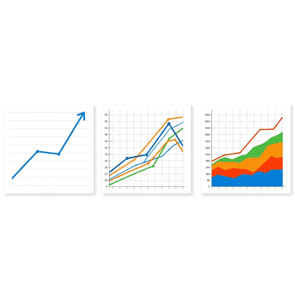
Simple line graphs plot a single variable over time or another continuous axis. You get one trend line, one story. Use this when your goal is clarity on a single metric, whether you're tracking monthly sales, server uptime, or daily temperature. The lack of competing lines makes patterns obvious.
Multiple line graphs layer two or more series on the same grid, each with its own line. This works when you need to compare trends that share a common scale, for example, revenue across three regions or conversion rates from four campaigns. Keep it under five lines or readability falls apart.
Compound line graphs stack trends vertically. Each line represents a category, and the vertical distance between any two lines shows that category's value. The top line represents the cumulative total. Use this structure when you want to see both individual contributions and the aggregate, like tracking server load split by process type or quarterly spend broken into headcount, software, and infrastructure.
How to Create a Line Graph: Step-by-Step Process
Start with clean, structured data. Organize your values in two columns: one for your continuous variable (time, distance, age) and one for the measurements. Remove any gaps or inconsistencies that will break the visual flow.
Plot your first data point where the x and y values intersect on the grid. Move sequentially through your dataset, marking each coordinate. Check that points align with both axes before moving on.
Connect the points with straight line segments in order. Each line shows the path from one measurement to the next. If you're plotting multiple series, use different colors or line styles for each.
Set your axis scales next. Choose increments that let all data fit without crowding. Label both axes with units, add a descriptive title, and include a legend if comparing multiple lines.
Reading and Interpreting Line Graphs: Finding the Story in Your Data
Read the overall shape first. Is the line climbing, falling, or cycling? A rising trend shows growth, a declining line signals loss, and waves suggest seasonality or recurring patterns.
Look for inflection points where direction changes sharply. These mark moments when something shifted in your business, product, or market. A sudden spike might reflect a campaign launch. A drop could signal a bug, outage, or competitor move.
When comparing multiple lines, focus on divergence and convergence. Lines pulling apart show one metric outpacing others. Lines coming together suggest equalizing performance or shrinking gaps between segments.
Check the slope between points to gauge speed of change. Steep climbs mean rapid acceleration. Gentle inclines show steady, controlled growth. The angle tells you how fast things are moving.
Common Line Graph Mistakes and How to Avoid Them
Starting the y-axis at a non-zero value can exaggerate small changes and mislead readers. A revenue line climbing from $98K to $102K looks dramatic when the axis runs $95K to $105K, but reveals a modest 4% gain on a zero-based scale. Unlike a histogram that groups data into bins, line graphs require proportional axes. Stick to zero unless you're plotting data with a narrow range far from zero, and call out any adjustment.
Overcrowded multi-line charts turn into spaghetti. More than five lines creates visual noise where trends disappear into overlapping colors. For relationship analysis between two variables, a scatter chart may work better. If you need to compare many series, split them into small multiples or filter down to the most relevant comparisons.
Inconsistent intervals break the visual contract. Skipping weekends or compressing Q4 into half the width of Q1 distorts the rate of change. Keep spacing uniform so slope accurately reflects speed.
Manipulating aspect ratio stretches or flattens trends. A tall, narrow chart makes gentle growth look explosive; a short, wide one hides volatility. When showing cumulative totals, an area chart can show volume better than lines alone. Maintain proportions that let the data speak without visual tricks.
Best Practices for Line Graph Design in Business Analytics
Keep line weight between 1.5 and 3 pixels. Thinner lines get lost on screens; thicker ones cover intersections and make data harder to parse.
Pick colors that work for colorblind readers. Blue, orange, and gray combinations hold up. Skip red-green pairings.
Label axes on the graph itself, not buried in a legend. Add units and round to what matters. Three decimal places add noise in most business reports. The Royal Statistical Society recommends directly labeling data points on line graphs instead of forcing readers to cross-reference legends and gridlines.
Set y-axis gridlines to match your decision points. If $500K is the target, label it. Don't make people estimate between $400K and $600K.
Line Graph Makers and Tools: Choosing Your Solution
Excel delivers quick charts when you're working with spreadsheet data. Google Sheets, Canva, and Plotly let you paste data and export images for decks.
BI tools (Tableau, Looker, Power BI) connect to databases and refresh automatically. They're built for recurring dashboards but require setup time and analyst support.
Tool Type | Setup Time | Data Connection | Best For | Technical Skill Required |
|---|---|---|---|---|
Excel and Google Sheets | Immediate - paste and chart in under 2 minutes | Manual uploads, CSV imports, or direct cell entry | One-time analysis, ad-hoc reports, and quick stakeholder presentations | Basic spreadsheet skills - sorting, formulas, and chart insertion |
Design Tools (Canva, Plotly) | 5-10 minutes for data import and styling | Manual data paste or file upload with no live refresh | Marketing materials, static reports, and polished presentation graphics | Minimal - drag-and-drop interface with preset templates |
BI Platforms (Tableau, Looker, Power BI) | Days to weeks for database setup, schema mapping, and dashboard configuration | Direct connections to SQL databases, data warehouses, and cloud storage with automatic refresh | Enterprise dashboards, recurring reports, and cross-team analytics with scheduled updates | High - requires SQL knowledge, data modeling, and tool-specific training |
AI-Powered Tools (Index) | Seconds - natural language query to chart with no manual configuration | Live connections to Snowflake, BigQuery, Redshift, and Postgres with real-time sync | Fast iteration, exploratory analysis, and conversational data workflows where speed matters more than pixel-perfect design | Low - plain English queries with no chart menus or axis configuration |
AI-driven tools interpret natural language requests and generate charts without manual configuration. They fit workflows where you need answers in seconds instead of days of setup.
Pick based on refresh cadence and collaboration scope. One-time reports tolerate manual exports. Recurring reports across teams need database connections and shared access.
Accelerating Analysis with AI-Powered Line Graph Creation in Index
Index generates line graphs from conversational prompts using natural language queries. Ask "show monthly revenue over the past year" or "compare signups across pricing tiers" and get a chart back in seconds. No axis setup, no chart-type menus.
The system reads your database schema, maps your question to the right tables, and picks the visualization. Time-series questions return line graphs. Breakdowns return tables. The choice depends on your query structure.
Refine through follow-up prompts. "Break that by region" adds multiple lines. "Focus on Q4" narrows the range. Natural language query tools like Index let you iterate without leaving the conversation. Each iteration completes in seconds, without ticketing.
Index connects to Snowflake, BigQuery, Redshift, and Postgres, so charts stay synced with live data. Teams work on the same view, adjusting questions and outputs together.
Final Thoughts on Line Graph Design and Analysis
You'll get the most from line graphs when you match the chart type to your data structure and keep design choices simple. A reliable line graph maker speeds up iteration and keeps your charts synced with fresh data, so you're analyzing trends instead of wrestling with formatting. Read the slope, watch for inflection points, and avoid the common traps of misleading scales or too many overlapping lines. Your next insight is already in the data.
FAQ
How do I choose between a line graph and a bar chart for my data?
Use a line graph when your data follows a meaningful sequence (time, distance, age) and you want to show change or trends. Bar charts work better for discrete categories without natural order, like comparing sales across different product types.
What's the fastest way to create a line graph from my database?
Connect your database (Snowflake, BigQuery, Redshift, or Postgres) to a tool that supports natural language queries, then ask "show [metric] over [time period]" to generate the chart in seconds without manual axis configuration or chart-type selection.
When should I avoid starting my y-axis at zero?
Start at zero unless your data has a narrow range far from zero (like temperature readings between 98°F and 102°F). If you adjust the axis, call it out explicitly to avoid misleading readers about the magnitude of change.
How many lines can I plot before my graph becomes unreadable?
Keep it under five lines on a single graph. Beyond that, overlapping colors and crossing paths create visual noise that hides trends. Split comparisons into separate small multiples or filter down to your most relevant series.
What does the slope between two points tell me about my data?
The slope shows your rate of change. Steep climbs mean rapid acceleration, gentle inclines indicate steady growth, and flat segments signal stability. A steeper angle between points means faster movement in your metric.