Productivity
Waterfall Diagram: Complete Guide to Creating and Using Waterfall Charts in March 2026
Complete waterfall diagram guide for March 2026. Learn to create waterfall charts in Excel, software engineering models, and geographic formation diagrams.

Three different fields use waterfall diagrams for completely different purposes. Finance teams track cumulative value changes across categories. Software engineers map sequential project phases from requirements to deployment. Geographers diagram how rivers erode rock to form plunge pools and gorges. If you search for waterfall diagram templates, you'll find Excel bridge charts, project flowcharts, and erosion illustrations all mixed together. This guide covers all three contexts so you pick the right format for your actual use case.
TLDR:
Waterfall charts visualize cumulative value changes through floating bars that track revenue changes, budget variance, and P&L performance.
Excel's native waterfall chart type automates running totals, but complex stacked or horizontal variations require manual positioning formulas.
The waterfall model in software engineering sequences six phases (requirements through maintenance) that complete before the next begins.
Geographic waterfalls form where rivers erode soft rock below hard rock through hydraulic action, abrasion, and chemical solution.
Index builds waterfall charts from plain-English queries connected to your warehouse or SaaS sources for instant, live variance analysis.
Waterfall Chart Fundamentals for Data Visualization
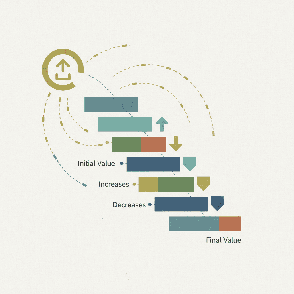
Waterfall charts display sequential changes that build to a final value in data visualization. Each bar floats above or below the running total, creating a stepped visual that tracks cumulative impact across categories or time periods.
The format stacks positive contributions upward and negative ones downward from a baseline. You see exactly which factors drove growth and which dragged down the total.
Business teams call them bridge charts because they connect starting value to ending value. The floating columns also go by flying bricks or Mario charts, after the video game character jumping between suspended blocks.
You'll see waterfall charts in budget variance reports, quarterly revenue breakdowns, and P&L waterfalls that break down profit changes. Financial waterfall models help visualize top-line revenue and cash flow movement.
How to Create a Waterfall Chart in Excel
Excel's waterfall chart type lives in the Insert tab under Charts. With 1.1-1.5 billion global users including 7.6 million business development professionals, Excel remains the dominant tool for business analysis and chart creation. Start by arranging your data in two columns: one for category labels, one for values.
Positive numbers show increases, negatives show decreases.
Select your data range, click Insert, then choose Waterfall from the chart options. Excel automatically floats the bars and calculates running totals.
Right-click any bar to set it as a total. These anchor to the axis instead of floating. Mark your starting point and final value as totals.
Color customization happens in Format Data Series. Change fill colors for increases, decreases, and totals separately.
Data labels show exact values on each bar. Add them through Chart Elements.
Advanced Waterfall Chart Variations in Excel
Standard waterfall charts track one measure across categories. Complex scenarios call for different structures.
Stacked Waterfall Charts
Stacked variations layer multiple components within each bar, breaking down revenue gains by product line or region per quarter. Excel lacks native stacked waterfalls, so build them by combining stacked column charts with manual floating calculations.
Calculate cumulative positions for each segment, then use custom formulas to position bar sections. Tedious work, but necessary for showing composition alongside flow.
Multiple Series and Horizontal Charts
Multiple series waterfalls compare two scenarios side by side: budget versus actual or year-over-year performance. Create two separate charts and align them, or use clustered columns with floating bar positioning.
Horizontal waterfalls flip orientation, handling long category names better or supporting left-to-right narrative sequences. Rotate a standard chart using Switch Row/Column, then adjust bar colors manually.
Different problems need different views.
Waterfall Chart Templates and Free Resources
Microsoft's template gallery includes free waterfall chart templates for Excel, PowerPoint, and Word. Search "waterfall" in the Office template browser or download directly from templates.office.com.
Excel templates come pre-formatted with data entry cells and automatic calculations. PowerPoint templates offer static diagrams for presentations. Word templates provide documentation layouts with embedded chart placeholders.
Third-party sites host downloadable waterfall templates. Look for versions that include clear labels, customizable color schemes, and example data you can replace.
Good templates separate input cells from chart references. You enter your values, the chart updates automatically.
The Waterfall Model in Software Engineering
The waterfall model in software engineering sequences development into distinct phases that cascade downward. Each stage completes before the next begins: requirements, design, implementation, testing, deployment, and maintenance.
In 1985, the United States Department of Defense adopted waterfall in the DOD-STD-2167 standard for working with software development contractors, defining six sequential phases.
The structure appeals to projects with fixed requirements and regulatory constraints. Hardware integrations, compliance-heavy systems, and defense contracts favor waterfall's predictability. A 2020 survey found that 56% of project professionals had used traditional waterfall models in the previous year.
The tradeoff: inflexibility. Late-stage requirement changes mean expensive rework. Testing happens after build completion, not during. Agile methodologies handle these limitations through iterative cycles and continuous feedback.
Waterfall Methodology Diagrams and Process Flows
Waterfall methodology diagrams map project sequences through flowchart symbols. Rectangles represent phases, arrows show progression, and diamonds mark decision gates where approval moves work forward or loops it back.
Standard diagrams flow top to bottom. Each phase connects to the next through a single path. Some teams add dotted feedback arrows between testing and earlier phases to show defect resolution paths.
PowerPoint and Visio work well for building these. Draw six boxes vertically, label each phase, connect with arrows. Add conditional branches at quality gates where stakeholders review deliverables before approving the next stage.
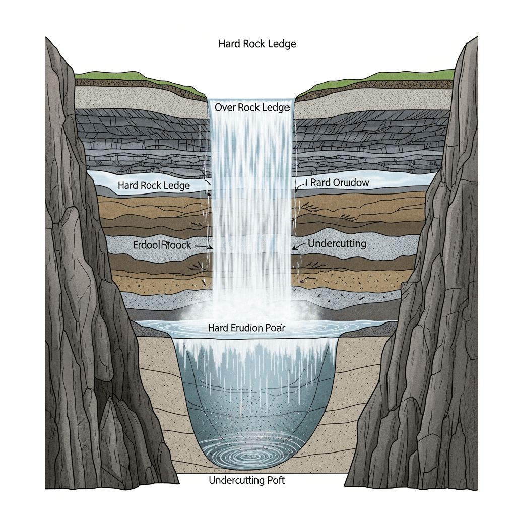
Physical Waterfall Formation in Geography
Waterfalls form where rivers cross hard rock layers sitting above softer rock. Water erodes the softer rock faster, creating a vertical drop.
Three erosion mechanisms create waterfalls:
Hydraulic action forces water into cracks, fracturing rock through repeated pressure
Abrasion grinds the riverbed as sediment and debris scrape surfaces
Solution chemically dissolves soluble minerals in certain rock types
Falling water excavates a plunge pool below. Turbulent water and swirling debris deepen the pool, undercutting the hard rock ledge. Eventually the overhang collapses.
This cycle repeats, moving the waterfall upstream and carving a gorge.
Specialized Waterfall Diagram Applications
Waterfall diagrams serve niche needs across medicine, engineering, and infrastructure design.
FDA waterfall plots map each clinical trial participant as a vertical bar, plotting tumor size changes to reveal treatment responders and outliers. Oncology teams rely on these charts to show drug efficacy to regulators in submission packages.
In vibration analysis, engineers layer frequency against time and amplitude to monitor rotating machinery. This three-dimensional view catches bearing wear and shaft misalignment weeks before equipment fails.
Pool and pondless waterfall plumbing diagrams trace pump circuits, valve placement, and return lines. Installers use these schematics to route underground reservoirs and electrical connections for backyard water features.
The Rockefeller waterfall method arranges charitable funds in tiered disbursement accounts that flow across generations and beneficiary organizations.
Waterfall Diagrams vs Alternative Visualization Methods
Waterfall charts work when you need to show how sequential changes accumulate to a total. They fail when simpler options communicate better.
Bar charts compare categories without showing progression. Pick bars when you want magnitude comparisons, not cumulative flow. Revenue by region needs bars, not waterfalls.
Line graphs and area charts track trends over continuous time periods. Choose lines for spotting patterns across months or years. Waterfalls show discrete steps between periods, not smooth movement.
Sankey diagrams trace flows between nodes and categories. Use them for mapping resource allocation or customer journeys across multiple stages. Waterfalls track linear value changes, Sankeys map branching paths.
Funnel charts display conversion through stages where volume drops at each step. Marketing and sales teams use funnel analysis to show attrition. Waterfalls add and subtract; funnels only decrease.
Pick waterfall charts when your story needs cumulative impact across defined steps.
What Is a Waterfall Diagram and Its Primary Uses
A waterfall diagram changes meaning across disciplines. In finance and analytics, it's a chart tracking cumulative value changes from start to end. Software teams use waterfall diagrams to map sequential project phases. Geographers diagram how rivers erode rock to form waterfalls.
Business analysts plot revenue movement and variance. Engineers document requirements through deployment. Students trace erosion patterns and plunge pool formation.
The term unites three distinct visuals: cumulative flows in data, linear workflows in projects, and physical formation in geography.
Context | Primary Purpose | Key Components | Typical Users | Common Applications |
|---|---|---|---|---|
Finance & Data Visualization | Track cumulative value changes from starting point to final total using floating bars | Floating bars, running totals, positive and negative contributions, baseline anchor points | Business analysts, finance teams, revenue operations, data visualization specialists | Budget variance reports, quarterly revenue breakdowns, P&L analysis, bridge charts showing profit changes |
Software Engineering | Map sequential project phases that complete before the next begins | Six distinct phases: requirements, design, implementation, testing, deployment, maintenance | Project managers, software engineers, compliance teams, defense contractors | Fixed-requirement projects, hardware integrations, regulatory systems, DOD-STD-2167 compliant development |
Geography & Earth Science | Diagram physical waterfall formation through river erosion processes | Hard rock layers, soft rock erosion, hydraulic action, abrasion, solution, plunge pools, gorges | Geography students, geologists, earth science educators, environmental researchers | Erosion pattern analysis, geological formation studies, river system documentation, educational diagrams |
Using Index to Create and Share Waterfall Analysis
Index builds waterfall charts from natural language queries connected to your data warehouse. Ask "show me revenue variance by quarter" and get an interactive chart in seconds.
Connect Index to your warehouse (Snowflake, BigQuery, Redshift) or SaaS sources like Stripe and Salesforce to build a dashboard. Your waterfall analysis updates with live data automatically.
Financial variance reports and budget-to-actual breakdowns happen through chat instead of spreadsheet work. Revenue operations teams ask questions, get waterfall visuals, and share them with stakeholders the same day.
Final Thoughts on Building Waterfall Diagrams
The best waterfall chart depends entirely on what you're trying to show and who needs to understand it. Financial teams need cumulative flow, project managers need sequential phases, and students need formation diagrams. Match your format to your story, keep the visuals clean, and your data will speak for itself.
FAQ
How do I make a waterfall chart float the bars correctly in Excel?
Select your data range, click Insert > Waterfall chart, then right-click any bar that represents a starting point or final total and choose "Set as Total" to anchor it to the axis instead of floating.
What's the difference between a waterfall chart and a stacked bar chart?
Waterfall charts show sequential changes that accumulate to a final value with floating bars, while stacked bar charts display static composition of categories without showing flow or cumulative impact.
When should I use a waterfall diagram instead of a line graph?
Pick waterfall charts when you need to show discrete step-by-step changes between periods (like quarterly revenue variance), not continuous trends over time.
Can I build waterfall charts directly from my data warehouse?
Yes. Tools like Index connect to Snowflake, BigQuery, or Redshift and generate waterfall charts from natural language queries without manual Excel work, updating automatically as your data changes.
Why do waterfall charts work better for variance analysis than simple bar charts?
Waterfall charts trace exactly which factors increased or decreased your total, making it obvious what drove growth or dragged performance down across sequential categories.