Productivity
How to Create a Scatter Plot: Complete Guide for March 2026
Learn how to create scatter plots in Excel, Python, and online tools. Step-by-step guide with examples, customization tips, and best practices for March 2026.

You've got two columns of data and a hypothesis about how they might connect. The fastest way to test it is a scatter plot, but getting from raw numbers to a readable chart means choosing between Excel's interface, Python's libraries, or browser-based tools. Each option has different strengths depending on your dataset size and how often you'll repeat the analysis. Here's how to create a scatter plot in Excel, Python, and online generators, plus when each approach actually makes sense.
TLDR:
Scatter plots reveal relationships between two numeric variables through x-y coordinates
Excel offers one-click scatter plots with trendlines; Python provides full control via matplotlib
Color-coding series and adjusting axis ranges turn raw data into actionable patterns
Avoid overplotting large datasets by reducing marker size or increasing transparency
Index generates scatter plots from plain English questions like "show CAC versus LTV"
What Is a Scatter Plot and When to Use It
A scatter plot displays the relationship between two numeric variables by plotting individual data points on an x-y coordinate system. Each dot represents a single observation, with its horizontal position determined by one variable and its vertical position by another.
The value comes from pattern recognition. When you plot enough points, relationships show up through visualization: positive correlations (both variables increase together), negative correlations (one rises while the other falls), or no correlation at all.
Reach for a scatter plot when comparing two continuous variables. Common use cases include analyzing sales versus marketing spend, tracking user engagement against session duration, or testing the relationship between product price and conversion rate.
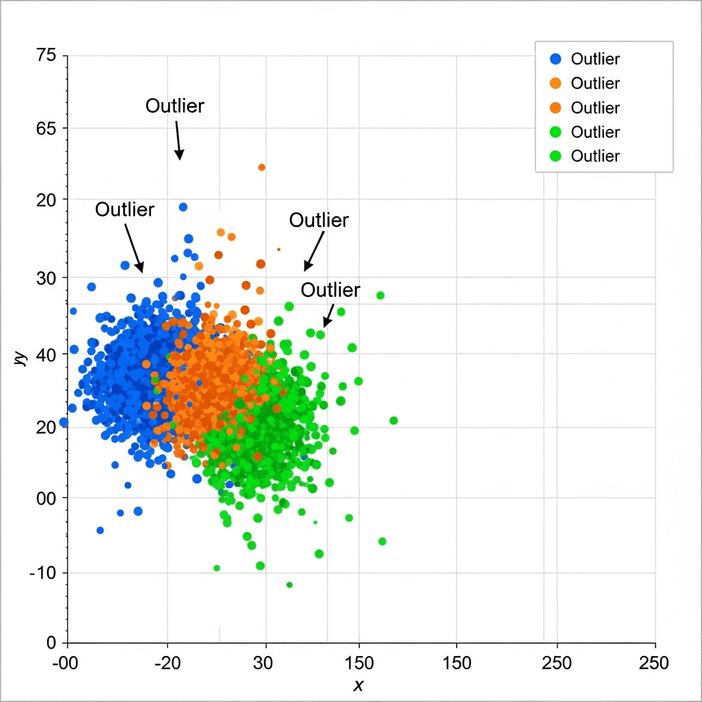
Scatter plots also surface outliers quickly. That single dot sitting far from the cluster deserves investigation. Maybe it's a data entry error, or maybe it's your most valuable customer behaving differently from the rest.
How to Create a Scatter Plot in Excel
Start by organizing your data in columns. Each variable gets its own column with headers in the first row. For a basic two-variable scatter plot, you need two columns: one for x-axis values and one for y-axis values.
Creating a Basic Scatter Plot
Select your data range, including headers. Click the Insert tab, then choose the Scatter chart icon from the Charts group. Excel offers several scatter plot variations. Pick the basic dots-only version to start.
The chart appears instantly. Excel automatically assigns your first selected column to the x-axis and the second to the y-axis. If they're reversed, right-click the chart, select "Select Data," and swap the series.
Adding Multiple Variables
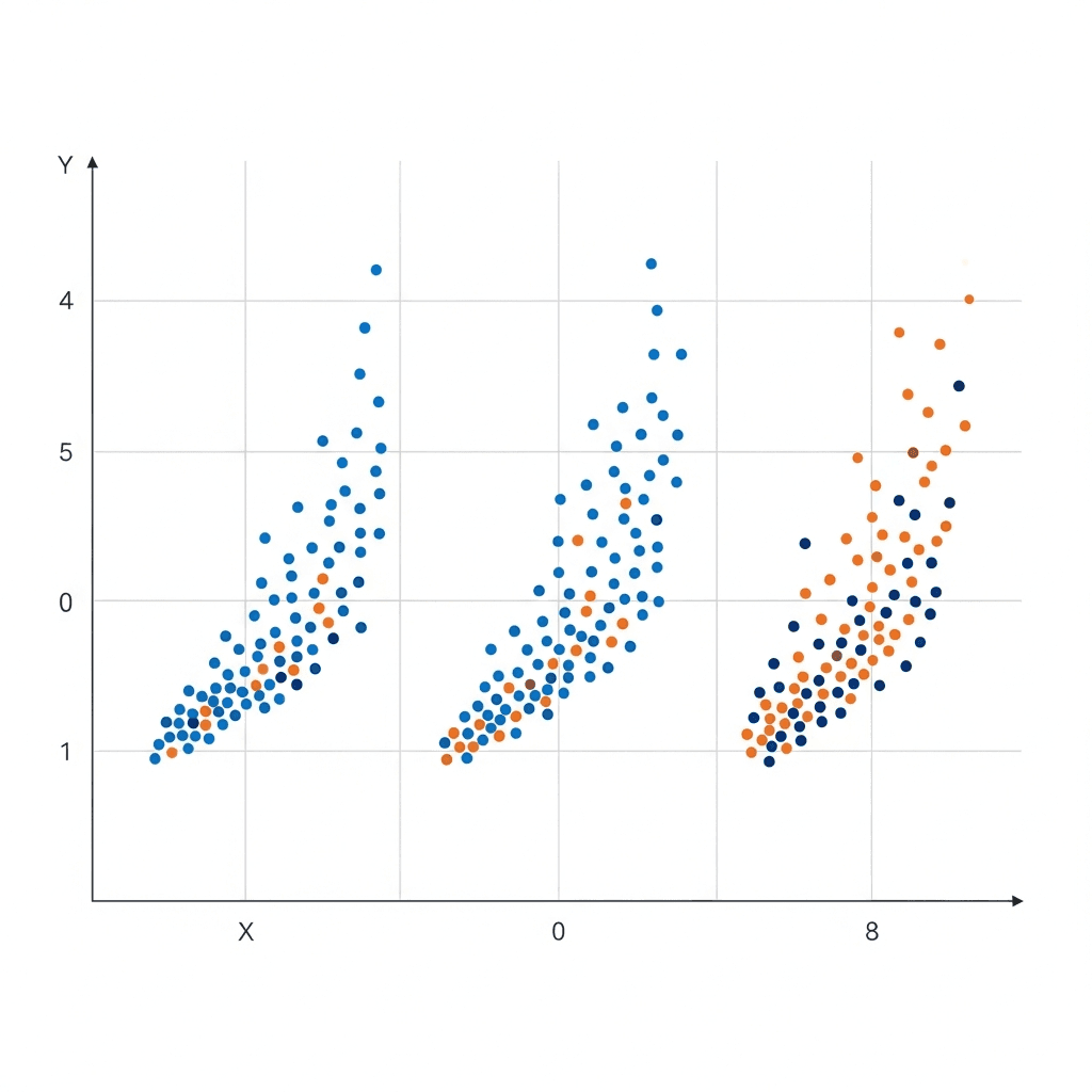
To plot additional data sets on the same chart, right-click your existing scatter plot and choose "Select Data." Click "Add" under Legend Entries, then specify the x and y ranges for your new series. Each series appears as a different color.
Adding a Trendline
Right-click any data point series and select "Add Trendline." Excel offers linear, exponential, polynomial, and other regression options. Check "Display Equation" and "Display R-squared" to show the mathematical relationship and correlation strength directly on your chart.
How to Create a Scatter Plot in Python
Python gives you three main options for scatter plots: matplotlib for full control, seaborn for statistical styling, and pandas for quick exploratory work.
Matplotlib Basics
Matplotlib is the foundation. Import it and call scatter() with your x and y data:
Customize markers and colors with plt.scatter(x, y, color='red', marker='x', s=100). The s parameter controls dot size.
Seaborn for Statistical Plots
Seaborn builds on matplotlib with better defaults and statistical features:
Pandas Quick Plotting
When working with dataframes, pandas offers the fastest route during initial data exploration:
Free Online Scatter Plot Makers and Tools
Online scatter plot makers work best for quick visualizations when you don't want to open Excel or write code. Most accept CSV uploads or manual data entry and generate charts in your browser.
Google Sheets offers scatter plot creation similar to Excel, with automatic cloud saving and easy sharing. Upload your CSV, select your columns, and insert a chart. It handles basic trendlines and multiple series without requiring software licenses.
Desmos provides an interactive graphing calculator that excels at mathematical scatter plots. Type data points directly or paste from a spreadsheet. The interface updates instantly and works well for educational purposes or presentations where you need clean, simple charts.
Browser-based tools hit limits with large datasets. Uploading 10,000+ rows often causes lag or crashes. They also lack statistical features like confidence intervals or correlation matrices that Python libraries provide.
For one-off charts or sharing quick insights with non-technical teammates, online generators save time. For repeated analysis or production dashboards, you need something more capable.
Method | Setup Requirements | Best Use Cases | Customization Level | Data Size Limit | Learning Curve |
|---|---|---|---|---|---|
Excel | Microsoft Office license or Office 365 subscription | Business reporting, one-time analysis, sharing with non-technical stakeholders, adding trendlines quickly | Moderate - point-and-click formatting, built-in trendlines, multiple series support | 1 million rows per worksheet, but performance degrades above 100k points | Low - familiar interface for most business users |
Python matplotlib | Python installation, matplotlib library, code editor or Jupyter notebook | Automated reporting, production dashboards, precise control over every visual element, complex multi-plot layouts | High - full programmatic control over colors, markers, annotations, layouts, and statistical overlays | Limited only by available RAM, handles millions of points with proper optimization | High - requires Python programming knowledge and matplotlib syntax |
Python seaborn | Python installation, seaborn and pandas libraries, code editor or Jupyter notebook | Statistical analysis, publication-ready visualizations, exploratory data analysis with regression lines | Moderate to High - statistical defaults with customization options through matplotlib integration | Handles large datasets efficiently with built-in sampling and density options | Moderate - easier than matplotlib but still requires Python and dataframe concepts |
Python pandas | Python installation, pandas library, code editor or Jupyter notebook | Quick exploratory analysis during data cleaning, rapid iteration on dataframe columns | Low to Moderate - basic plots with limited styling options | Matches your dataframe size, typically hundreds of thousands of rows | Moderate - requires pandas dataframe knowledge |
Google Sheets | Free Google account and web browser | Collaborative analysis, sharing with distributed teams, cloud-based workflows without software installation | Moderate - similar to Excel but with fewer advanced options | 10 million cells per spreadsheet, but browser performance issues above 50k points | Low - similar to Excel with automatic cloud saving |
Online Generators | Web browser and internet connection only | Quick one-off visualizations, educational demonstrations, presenting simple relationships without tools | Low - basic color and label options, limited statistical features | Typically crashes or lags above 10k rows depending on browser and tool | Very Low - paste data and click generate |
Customizing Your Scatter Plot for Better Insights
Raw data points tell part of the story. The right customizations turn noise into signal.
Color-Coding Multiple Series
When comparing different groups or time periods, assign each series a distinct color. In Excel, click any data point and change the fill color under Format. In Python, pass a list to the color parameter. Keep your palette simple: three to four colors maximum or the chart becomes unreadable.
Labeling Key Points
Add labels to outliers or notable observations to provide context. Excel users can manually add data labels by right-clicking individual points. Python requires matplotlib's annotate() function with x-y coordinates. Only label points that matter.
Adjusting Axis Ranges
Default axis ranges often waste space or hide details. Manually set min and max values to zoom into your data's actual range. In Excel, right-click the axis and select "Format Axis." Scatter plots work best when the full range of variation is visible without excessive empty space distorting scale perception.
Common Scatter Plot Mistakes and How to Avoid Them
Overplotting Large Datasets
When thousands of points overlap, you see a blob instead of a pattern. Reduce marker size, increase transparency (alpha values below 0.5), or use hexbin plots and histograms for density visualization. Python's seaborn offers alpha and hue parameters that help distinguish crowded regions.
Confusing Correlation with Causation
Two variables moving together doesn't mean one causes the other. Ice cream sales and drowning rates both track with summer weather. Strong correlations demand further investigation into underlying mechanisms before drawing causal conclusions.
Ignoring Outliers
That distant point might be a typo or your most interesting finding. Always investigate before removing it. Check if the outlier represents real behavior, measurement error, or data entry mistakes.
Using Scatter Plots to Analyze Data Relationships in Index
In Index, you can ask "show me customer acquisition cost versus lifetime value" and get a scatter plot instantly. No chart configuration, no data wrangling, just a plain English question.
The AI parses your request, pulls the right metrics from your connected data sources, and builds the visualization. If you spot an outlier cluster of high-CAC, low-LTV customers, you can follow up with "filter to enterprise segment" or "show last six months only" without rebuilding the chart.
Index works best when your underlying data is clean and your metric definitions are consistent. The AI can't fix schema drift or resolve conflicting CAC or LTV calculations across tables. But when your data foundation is solid, it cuts scatter plot creation from minutes to seconds.
Final Thoughts on Choosing Your Scatter Plot Method
Every scatter plot maker trades off speed against control. Excel gives you repeatability, Python gives you customization, and AI gives you natural language convenience. Your data volume and team skills determine the right choice. Start where you are, not where you think you should be.
FAQ
How do I add a trendline to a scatter plot in Excel?
Right-click any data point series in your scatter plot and select "Add Trendline." Excel offers linear, exponential, and polynomial options; check "Display Equation" and "Display R-squared" to show the correlation strength and mathematical relationship directly on the chart.
What's the difference between matplotlib and seaborn for scatter plots in Python?
Matplotlib gives you full control over every chart element but requires more code, while seaborn builds on matplotlib with better statistical defaults and styling out of the box. Use matplotlib when you need precise customization, seaborn when you want publication-ready statistical plots faster.
When should I use an online scatter plot maker instead of Excel or Python?
Online tools work best for quick one-off charts when sharing with non-technical teammates or when you don't have Excel or Python available. For datasets over 10,000 rows, repeated analysis, or production dashboards, use Excel or Python since browser-based tools lag or crash with large data.
Can I plot more than two variables on a single scatter plot?
Yes. In Excel, right-click your chart, select "Select Data," click "Add," and specify x-y ranges for each new series (each appears as a different color). In Python, call plt.scatter() multiple times with different datasets, or use seaborn's hue parameter to color-code a third categorical variable.
Why do my scatter plot points look like a blob instead of showing patterns?
You're hitting overplotting from too many overlapping points. Reduce marker size, increase transparency (set alpha below 0.5 in Python), or switch to hexbin plots for density visualization. Your underlying pattern exists but gets hidden when thousands of dots stack on top of each other.