Productivity
Box and Whisker Diagram: Complete Guide and Tools (March 2026)
Learn box and whisker diagrams with our complete March 2026 guide. Covers five-number summary, outlier detection, Excel charts, and free tools for quartile analysis.

You're comparing customer segments or testing for outliers in transaction amounts, and someone suggests a box and whisker diagram because it shows spread and center without cramming every data point onto a chart. The challenge is remembering which line represents the median versus Q1, how far whiskers extend before you mark a value as an outlier, and whether your distribution skews left or right based on box shape. We'll walk through the five-number summary, the 1.5 IQR rule for fences, how to interpret asymmetric whiskers, and the fastest ways to generate box plots in Excel or with free tools that handle quartile calculations automatically.
TLDR:
A box plot shows five values (min, Q1, median, Q3, max) to reveal spread and outliers fast.
You identify outliers by calculating 1.5×IQR fences; points beyond are marked as dots.
Excel 2016+ builds box plots natively; free tools like Calculator.net and GeoGebra work online.
Compare medians, box widths, and whisker lengths side-by-side to spot group differences.
Index generates box plots from plain-English questions and recalculates quartiles instantly.
What Is a Box and Whisker Diagram
A box and whisker diagram (also called a box plot) is a statistical chart that displays five key values: minimum, first quartile, median, third quartile, and maximum. Each element reveals how data points are distributed across your dataset.
Box plots show outliers and skewness without plotting every value. You can quickly compare groups, check data quality, and spot values that fall outside the normal range. Statisticians and analysts use them when they need a compact summary of spread and center before running deeper analysis.
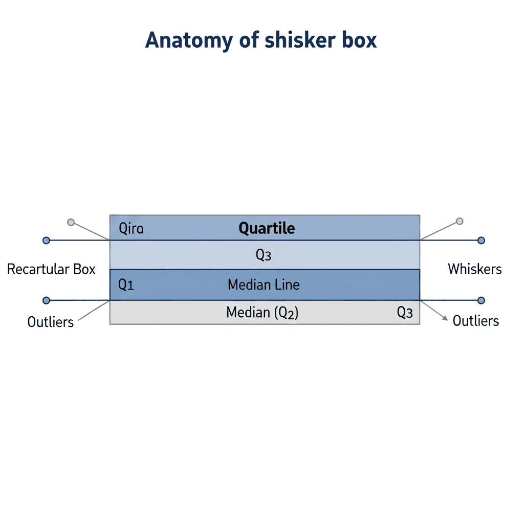
Anatomy of a Box Plot: Understanding the Five Number Summary
The five number summary maps to visible box plot elements: the box spans Q1 to Q3, with the median marked inside, and whiskers extend toward the minimum and maximum. The interquartile range (IQR) is the distance between Q1 and Q3. A narrow box indicates tightly grouped data; a wide box reveals higher variability.
How to Construct a Box and Whisker Plot Step-by-Step
Start with your raw dataset and sort all values from smallest to largest. This ordering is required for quartile calculations.
Calculate the median by locating the middle value. With an odd count, take the center value; with an even count, average the two middle numbers.
Split your sorted data at the median. Q1 is the median of the lower half; Q3 is the median of the upper half. The IQR equals Q3 minus Q1.
Multiply the IQR by 1.5. Subtract this from Q1 for the lower fence; add it to Q3 for the upper fence. Whiskers extend to the smallest and largest values within these boundaries. Points beyond are outliers.
Interpreting Box Plots: Reading Skewness and Distribution
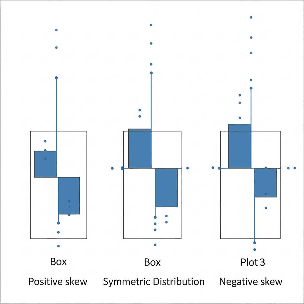
Once you've built a box plot, the visual shape tells you how values cluster and where the distribution leans. The median line's position inside the box and the relative whisker lengths reveal whether data skews left, right, or stays balanced.
When the median sits closer to Q1 and the right whisker stretches longer than the left, you're looking at positive skew. Most values pile up on the lower end, with a long tail pulling toward higher numbers.
Negative skew appears when the median hugs Q3 and the left whisker extends farther. Data concentrates at the high end with a tail trailing down.
A symmetric distribution centers the median between Q1 and Q3, with whiskers roughly equal in length. The data spreads evenly around the middle.
Understanding and Identifying Outliers in Box Plots
Outliers appear as individual dots beyond the whiskers when values exceed 1.5 times the IQR from Q1 or Q3. These aren't errors; they're observations far from the median cluster.
Box plots need at least 20 points per group for stable quartiles. Smaller samples make each unusual value warp the whiskers, turning noise into false signals.
When you find outliers, verify the source record first. Real extremes often carry the strongest signal in customer behavior, failure modes, or performance edges. Invalid entries and duplicate records just pollute downstream calculations.
Comparing Multiple Box Plots for Group Analysis
Placing box plots side-by-side lets you compare distributions across categories in a single view. Each group gets its own box, aligned on the same scale so you can scan medians, spreads, and outliers at a glance.
Start by comparing median lines. Groups with higher medians show shifted center points. Next, compare box widths. A wider IQR means higher variability within that group; a narrow box shows consistency. Two groups can share the same median yet differ in predictability.
Check whisker lengths and outlier counts. A group with more outliers or extended whiskers may include edge cases or data quality issues.
Box and Whisker Plot Excel: Creating Charts in Microsoft Excel
Excel added native box and whisker charts in 2016. Select your data range with headers, then click Insert > Insert Statistic Chart > Box and Whisker. Excel calculates quartiles automatically.
For multiple series, arrange data in adjacent columns with one header row. Select all columns and insert the chart. Each series appears as a separate box on the same axis.
Right-click the chart to adjust whisker calculations between inclusive and exclusive median methods, toggle outlier markers, or switch to horizontal orientation. Excel's options live under Chart Design and Format.
If your chart doesn't appear, check that your data contains numeric values without blanks. Excel ignores text and empty cells without warning.
Box Plot Practice Problems and Educational Resources
Most textbooks and educational sites offer free box plot worksheets by grade level. Problems at grades 6 to 8 focus on constructing plots and identifying the five-number summary; grades 9 to 12 add outlier detection and skewness interpretation.
Khan Academy provides interactive exercises with instant feedback on quartile calculations. Each problem includes step-by-step solutions when needed.
Search for downloadable worksheets from school districts and math sites. Look for answer keys that show calculations beyond just final values. Practice by hand before using software to catch data entry errors and understand how new points shift quartiles.
When to Use Box Plots vs. Other Visualizations
Box plots work best when comparing distributions across groups or spotting outliers at a glance. Choose them over histograms when you have five or more categories to compare side by side.
Histograms show the full shape of a single distribution, including gaps and bimodal patterns that box plots compress into quartiles. Use a histogram when you need frequency counts at specific ranges, or consider an area chart when tracking cumulative totals over time.
Scatter plots reveal relationships between two variables. Pick them when testing correlation or hunting for clusters, not summarizing spread.
Free Online Box Plot Makers and Tools
Several free web tools generate box plots without installing software. Input methods and customization options vary by tool.
Calculator.net accepts raw datasets as comma-separated values and computes quartiles automatically. Paste your numbers, click Calculate, and download a PNG. No account required.
GeoGebra offers an interactive statistics calculator that plots box charts from lists or imported CSV files. Drag chart elements to see how individual points shift quartiles.
StatKey from Lock5 generates box plots from either raw data or pre-calculated five number summaries. Enter minimum, Q1, median, Q3, and maximum directly when you already know those values. The tool marks outliers using the 1.5 IQR rule and exports images for reports.
Tool | Input Method | Key Features | Best For |
|---|---|---|---|
Excel 2016+ | Select data range with headers, then Insert > Insert Statistic Chart > Box and Whisker | Native quartile calculations, multiple series support, adjustable whisker methods, horizontal or vertical orientation, outlier marker toggle | Teams already using Microsoft Office who need quick charts with customization options and integration with existing spreadsheets |
Calculator.net | Paste comma-separated values directly into web form | Automatic quartile computation, PNG download, no account required, instant results | Quick one-off box plots when you need a simple visual without software installation or complex setup |
GeoGebra Statistics Calculator | Enter lists manually or import CSV files | Interactive chart elements, drag-to-see quartile changes, real-time updates, educational focus | Learning how individual data points affect quartiles and working through statistical concepts with hands-on manipulation |
StatKey | Raw dataset or pre-calculated five number summary (min, Q1, median, Q3, max) | Accepts both raw and summary data, applies 1.5 IQR outlier rule, image export for reports | Situations where you already know quartile values and need to visualize them without recalculating from raw data |
Index | Plain-English questions connected to your data warehouse | AI-generated queries, automatic IQR fence calculations, live charts, team collaboration, instant recalculation with filters | Teams comparing dozens of categories or segments who need real-time box plots that update as data changes |
Creating Interactive Box Plots with Index
Index builds box plots from questions like "show response time by region" without manual calculations. Ask for outlier filters or segment splits, and the AI rebuilds quartiles in seconds. Check our updates page to see the latest features and improvements to chart generation.
Teams review the same live chart instead of emailing screenshots. When you connect your warehouse, Index reads schema and writes the query, calculating IQR fences and whisker positions automatically.
Final Thoughts on Using Box and Whisker Charts
Once you grasp how the box, whiskers, and outliers map to your dataset, you can scan distributions faster than any table of means. Free box plot makers get you started, but when you're comparing dozens of categories or filtering on the fly, you need a tool that recalculates quartiles in real time. Practice reading skew and IQR by hand first, then automate the repetitive parts.
FAQ
How do I calculate outliers in a box plot?
Multiply the interquartile range (IQR) by 1.5, then subtract that value from Q1 for the lower fence and add it to Q3 for the upper fence. Any data points falling beyond these fences are outliers.
What's the minimum sample size needed for a reliable box plot?
You need at least 20 data points per group for stable quartile calculations. Smaller samples cause individual values to distort the whiskers and turn random noise into misleading signals.
When should I use a box plot instead of a histogram?
Use box plots when comparing distributions across five or more categories side by side. Choose histograms when you need to see the full shape of a single distribution, including gaps and bimodal patterns that box plots compress.
Why doesn't my box and whisker chart appear in Excel?
Excel ignores text entries and empty cells without warning. Check that your data range contains only numeric values with no blanks, then reinsert the chart from Insert > Insert Statistic Chart > Box and Whisker.
How do I read skewness from a box plot?
Check where the median line sits inside the box and compare whisker lengths. Positive skew shows the median closer to Q1 with a longer right whisker; negative skew places the median near Q3 with a longer left whisker; symmetric distributions center the median with equal whiskers.